Colour Curation, A Feast For The Eye
Challenge: This health professional couple liked their inner city location and saw potential in their 1980’s town home. The architectural lines and space allocations inside the home offered us what I like to call “great bones”. The drive for change came from the inefficient kitchen and general lack of brightness throughout the spaces. This couple’s full scheduled life had them longing for their home to offer not only a place to unwind in, but a place that could showcase their love for colour, contemporary design, and appreciation for the mid-century modern era.
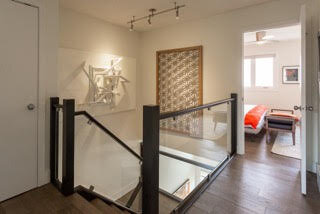
Approach: The kitchen’s new design was primarily focused on layout. We began by moving the range underneath the window. This unconventional placement for a cooking appliance not only allowed us to create a better working triangle, it also brought natural light into the cooking area. It also gave us the opportunity to artfully highlight around the window with floating stainless steel shelves and mosaic tile. From there, we shifted our focus to the wall between the kitchen and the powder bathroom. By moving this wall, we freed up enough space to create an island, 2 pantry storage areas and even a dedicated space for baking. Architecturally, design elements like cabinetry, stair railings and the fireplace were kept simplistic and streamlined in nature. Material selections were driven by contrast, texture and shape. Generally the wall and trim colours were kept bright and neutral, this provided the canvas for pops of colour on a couple of walls and on a large light fixture in the kitchen. This was the jumping off point for furniture, art and accessory selections that could be bold, whimsical and energetic, yet still soft and sophisticated.
Result: The perfect place for this couple to discharge from their full scheduled day, relax in spaces artfully curated for them and enjoy the functionality that each space now offered.